|
|
Post by Gokhan on May 1, 2010 0:29:17 GMT -8
I prefer Expo.
Moreover, as others pointed out, Metro's proposed color for Aqua is not Aqua but Light Blue. So, now, we may end up with two Blue Lines and can't tell which one is which.
Webster defines aqua as "a light greenish-blue color."
There is hardly any green in Metro's proposed color. They also proposed to represent aqua with teal, which is inaccurate as well.
|
|
|
|
Post by redwings105th on May 1, 2010 7:53:43 GMT -8
You mean something like this?  |
|
|
|
Post by Gokhan on May 1, 2010 8:27:12 GMT -8
You mean something like this? Yes, they would be shades of aqua. Wikipedia defines aqua the same as cyan, with no red and equal and maximum amount of blue and green: 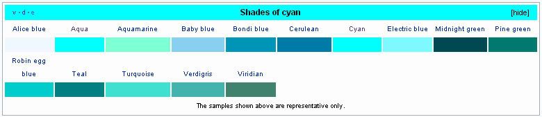 Compare this to "Metro's Aqua:"  I like the turquoise better for use on maps, as it is easier to distinguish than cyan (aqua) and it would print and look better. Likewise teal would look OK too but it's a bit too dark to go with the spirit of the name "Aqua." On the other hand, cyan (aqua) when printed would look too light. It would be hard to see and somewhat confusing with the "Blue Line," especially when the two colors are not next to each other. So, it turns out that the "color people" in Metro are color-blind after all. LOL As others pointed out as well, the best is to allow flexibility, keep calling this line Expo as everyone does, and decide on the best shade of cyan/aqua/turquoise/teal over time for the legends, and, even better, change the names of the other lines over time: Wilshire Line, Hollywood Line, Long Beach Line, Eastside Line, San Gabriel Line, etc. are all much much better than the obscure and meaningless color names they are using now. |
|
|
|
Post by Alexis Kasperavičius on May 1, 2010 8:32:15 GMT -8
You know, something like 15% of people are color blind. Why not dispense with this silliness and give the routes names or numbers already? It has to happen at some point, why prolong the inevitable?
AK
|
|
|
|
Post by Tony Fernandez on May 1, 2010 8:42:18 GMT -8
That might have to happen when the Downtown Connector is built. It'll be a mess if you stick with colors after that.
|
|
|
|
Post by redwings105th on May 1, 2010 9:16:39 GMT -8
Just wondering but what about the color Viridian? Not including color-blind people that wouldn't look bad until the Regional Connector opens.
|
|
|
|
Post by Gokhan on May 1, 2010 9:21:06 GMT -8
I think both a name and a number together is the best. The lines in fact already have some numbers; so, all they need is names. (Expo Line will be 806 for example. Blue Line is 801.)
But colors will always be useful in the map legends and I have no problem with associating some sort of aqua with Expo for use on the maps.
|
|
|
|
Post by LAofAnaheim on May 1, 2010 11:42:24 GMT -8
You know, something like 15% of people are color blind. Why not dispense with this silliness and give the routes names or numbers already? It has to happen at some point, why prolong the inevitable? AK Every few months we keep going back to this name calling/color non-sense. I, for one, like the color coding. It's so popular in fact that other world-class cities do it as well (why do we have to copy New York?). Check out Chicago CTA --> www.transitchicago.com/travel_information/schedules.aspxBoston MBTA --> www.mbta.com/schedules_and_maps/subway/Point is, for every transit agency I can show you with colors..you can show me the same with letters and/or names. It just makes no difference! People can get use to each system's naming convention...it's not that hard! Heck, whenever I get to London I'm confused with what's the freakin' Jubilee Line, District Line, etc... At least in LA we color it (Red Line), so that when we look at a map we know where the Red Line travels to. Do you know what color a Jubilee Line or District Line is? |
|
|
|
Post by Gokhan on May 1, 2010 12:08:16 GMT -8
You know, something like 15% of people are color blind. Why not dispense with this silliness and give the routes names or numbers already? It has to happen at some point, why prolong the inevitable? AK Every few months we keep going back to this name calling/color non-sense. I, for one, like the color coding. It's so popular in fact that other world-class cities do it as well (why do we have to copy New York?). Check out Chicago CTA --> www.transitchicago.com/travel_information/schedules.aspxBoston MBTA --> www.mbta.com/schedules_and_maps/subway/Point is, for every transit agency I can show you with colors..you can show me the same with letters and/or names. It just makes no difference! People can get use to each system's naming convention...it's not that hard! Heck, whenever I get to London I'm confused with what's the freakin' Jubilee Line, District Line, etc... There is nothing nonsense about it, as this is a discussion board, and people are discussing something controversial. Do you know what color LADOT's "Dash F" is? You virtually only need the colors for the maps and you find them out in the map's legend.  |
|
|
|
Post by bluelineshawn on May 1, 2010 12:43:29 GMT -8
Metro already indicated that at some point they will go to either numbers or letters instead of colors. My guess is that will happen when they are required to rename some of the lines when the downtown connector opens. Otherwise they would have to rename some lines (gold/blue) twice. My preferences would go something like this:
1 - Long Beach to Foothill
2 - South Bay to Norwalk
3 - Santa Monica to Eastern somewhere
4- LAX to Expo (or Wilshire)
5? - West LA to Valley
A - LAUS to Western somewhere
B - LAUS to NoHo
C - Hollywood to A train
D - East Hollywood to 2 train on Vermont
|
|
|
|
Post by darrell on May 1, 2010 15:03:01 GMT -8
The San Diego Trolley uses multiple indicators for its three lines -- name (of color), color, and a symbol related to that color. Blue Line (Old Town to border) -- waveOrange Line (downtown to El Cajon) -- sunGreen Line (Mission Valley) -- treeAnother point Metro's Maya Emsden made back in 2006, that color names must work in different languages, was another reason for Aqua. |
|
|
|
Post by jeisenbe on May 1, 2010 15:07:46 GMT -8
bluelineshawn, I don't think we can use 1-digit numbers, unless we renumber all the downtown Metro buses (which use the 1-99 series). Perhaps if all buses were given 2 or 3 digit numbers we could use 1 digit numbers for the trains, but that will only give us 9 lines to work with.
If we are going to have some letters, we might as well have every rail line correspond to a letter, as in San Francisco. I actually like the idea of W-Wilshire, or E-Expo, C-Crenshaw. However, some of our routes do not follow a particular street and have more than one destination; what would we name the Gold Line to Pasadena and Azusa? So me might end up with random letters for some routes, like LADOT does with the downtown Dash buses.
The voting over at thesource.metro.net is heavily in favor of Aqua, among the listed colors. However, I agree that the color shown is too light blue, and could use a little green in it, more like the shade labeled as turquoise on Wikipedia. We could still call it Aqua, until the Regional Connector turns it into the Gold Line.
The BRT in the San Fernando Valley is frequent and fast enough to be real "Rapid Transit", and probably deserves to have a color, but I wish it could have been the Bronze line or Silver Line, to leave the primary colors for rail. If Expo were the Orange Line, it would be easily to imagine it integrating with the East-side Gold Line once the Regional Connector was finished.
|
|
|
|
Post by jeisenbe on May 1, 2010 15:31:36 GMT -8
As far as colors go, Chicago shows you can have 8 lines with distinct, legible colors. They have Red, Purple, Blue, Green, Yellow, Orange, Red, Pink and Brown. If they every expand the system, Silver and Black are two more options (though Black may not work with some sign designs). But 10 colors seems about the maximum limit. www.transitchicago.com/travel_information/schedules.aspxPink and Brown may not fit as nicely in the spectrum, but they, like gray/silver, are fairly distinct to the human eye, and are the most likely choices to have a specific name in most languages, after the 6 primary and secondary colors and black/white. From a legibility standpoint, it would make sense to add a Pink / Rose line and a Brown / Bronze / Copper line before going for Blue-Green / Teal / Cyan / Aqua, or another mixed color, but it may be too late for that. But this analysis suggest that the Crenshaw line should be a shade of pink or brown (call it Rose or Bronze, if you like). New York's map does not name the lines by colors, but it uses shades of Blue, Red, Orange, Yellow, Green, Purple, Gray and Brown and Lime; they could probably improve it by using pink instead of Lime for the G, but perhaps they can use pink in the future for the Second Avenue Subway when it is completed all the way to Lower Manhattan. www.mta.info/nyct/maps/submap.htmNew York uses both letters and numbers due to its history of competing private transit companies, prior to the unification of the system under the MTA. think they could make do with using only letters, but changing things now would just be confusing. |
|
|
|
Post by bluelineshawn on May 1, 2010 16:02:56 GMT -8
bluelineshawn, I don't think we can use 1-digit numbers, unless we renumber all the downtown Metro buses (which use the 1-99 series). Perhaps if all buses were given 2 or 3 digit numbers we could use 1 digit numbers for the trains, but that will only give us 9 lines to work with. I guess that Metro would have to stop putting bus and train lines on the same map which is unlikely. It seems like a simple and maybe even helpful thing to add the street, but labeling a line using that technique is overly complicated IMO. It almost implies that there's a "W" that's not Wilshire or an "E" that's not on Exposition. People want simple. They don't want colors that they don't even know (Aqua), hyphenated names, or lightly traveled streets (Expo). JMO. |
|
|
|
Post by metrocenter on May 1, 2010 22:47:22 GMT -8
Another point Metro's Maya Emsden made back in 2006, that color names must work in different languages, was another reason for Aqua. Aqua is the only color that remotely works in two languages. All the other colors are very language-dependent. Red=Rojo, Green=Verde, etc. In particular, Aqua and Blue could result in a translation problem. A non-Spanish speaker could think that Aqua is Spanish for Blue, or vice-versa. Place names are clearer. The Wilshire Line goes down Wilshire, the Long Beach Line goes to Long Beach, the East Line goes to Pasadena and East L.A. Also, this is part of SoCal tradition: our freeways (e.g., Hollywood Freeway) are named after places. Imagine what a mess we'd have if our freeways were named after colors. In this case, the problem is compounded by the fact that the Expo and Blue Lines will share tracks and stations. Two lines that share tracks should be clearly distinct from each other. Otherwise people who are color-blind or are unfamiliar with the system are going to board the wrong train. If they're going to go with Aqua, it's going to need to have more green mixed into the green-blue than it currently has. |
|
|
|
Post by rajacobs on May 2, 2010 9:43:20 GMT -8
Actually, because the intensity (light vs. dark) of Blue vs. Aqua are so different--there is no problem for color blind folks to discriminate between the two.
The problem comes between Blue and Purple (they just look the same!) and, in general when the definers get away from the primary colors. Typically Yellow, grass or flat Green is OK (vs lime green because lime green looks like yellow!); Red, Orange (think yellow-red as opposed to dark orange), and Blue are no problem. ...And light vs. darker versions of the primaries (specifically blue and red --> Light Blue or Aqua and then Pink) are no problem but other colors can be a nightmare!
I don't know why it's like this--rods and cone profusion in the eyes--this is just the way it seems to be. The objective is to move people, so the ability to discriminate is critical.
That's why words associated with the colors as well or color strips--something to distinguish the lines besides a confusion of shades would be wonderful!
|
|
|
|
Post by tobias087 on May 2, 2010 10:24:39 GMT -8
I happen to like the colors, since they some life to Metro rail. Letters and numbers sound very mechanical, but colors give a line a distinct flavor, even if they aren't that descriptive. As for the freeways, sure, they have the places in the names, but most of the time I hear people refer to them by their numbers, which isn't very descriptive either, and it's not a mess.
Bluelineshawn, I think using numbers and letters would be confusing. Most riders don't really care whether they're riding light rail or heavy rail (and may not even realize there's a difference), so they goal should be to have a naming system that integrates all the lines.
Also, as Metro moves in the direction of creating lines that will someday be extended and hook up with other lines, for instance the Crenshaw line with the South Bay extension or the 405 line to the Green line, the sensible thing to do may be to simply give it a place name and accept that it would be temporary pending the hookup. If we're running out of colors now, imagine how we'll be by the time the 405 line is built!
|
|
|
|
Post by darrell on May 2, 2010 12:29:09 GMT -8
When I was a regular BART rider in the 1970s its lines, although colored on the map, were mostly known by the endpoints of the four legs, e.g. the operator's announcement that "this train is destined for Concord". (No, this train is destined to be a train; it's destination is Concord.)
|
|
|
|
Post by jeisenbe on May 2, 2010 12:42:28 GMT -8
Darrell, BART still uses endpoints exclusively to refer to trains and line, althought the 5-color system of lines is a very strong part of the maps and marketing. The announcements usually say "This is a Richmond train" or "Next trains to San Francisco / Millbrae in 5 minutes", and no signage or announcements reference the color of the lines on the map. Unfortunately, some of the end-points are unwieldy after exentions of the lines. The former Daily City to Concord line is now the "San Francisco Airport (SFO) / Millbrae" to "Pittsburg / Bay Point" line. Good thing the displays have room for that many characters!
The last time a took Bart I saw a pair of confused Salt Lake City natives almost board the train to Fremont when they meant to go to San Francisco. Perhaps BART should uses colors, or at least shorter names.
|
|
|
|
Post by James Fujita on May 2, 2010 15:05:43 GMT -8
All this talk of BART gets me thinking that Los Angeles is falling into the same trap that San Francisco fell into.
BART and the Muni Metro work wonderfully, as I have experienced both several times in the past few months, but in all honestly, both systems suffer from the same choke point, namely Market Street. It's a bit annoying to be underneath downtown and realize that the next train is a K, the next one after than is L, the next one is M, the next one is K, when the one you want and need is J. Or, in the case of BART, the next trains are Fremont, Bay Point and Concord when you need Richmond.
I'm starting to get a bit worried that we're creating a system where riders will wait for Red/Purple trains, or Blue/Gold/Aqua trains, or even in the case of the South Bay, Green Line to LAX/Santa Monica, Crenshaw or Norwalk. It saves money to do it this way, but in the long run we are going to want a second Regional Connector.
That said, I hope that our existing colors can survive the First Regional Connector. I hate hate hate the New York style of doing things, where everything sounds and looks like it was designed by a deranged puzzle maker. Too impersonal.
I'm not that fond of the Muni Metro F, J, K, M, N system either but at least they have Ocean Beach or Church on them as well.
My preference would be something similar to London or Tokyo; District=green, Ginza=orange. I'll admit it gets a little complicated when you have Shinjuku light green and Asakusa pink, but the maps are readable and the system works.
Maybe a color-blind person can't tell the difference between Hanzomon purple and Marunouchi red, but at least those trains don't share the same tracks (the one being overhead wire and the other being 3rd rail.)
[ A metaphor: You don't remove stairs because wheelchair users can't use them, you ADD elevators. ]
Here's to Long Beach blue, Pasadena gold, Exposition aqua/teal, Westside purple and Hollywood red.
|
|
|
|
Post by roadtrainer on May 2, 2010 16:24:20 GMT -8
|
|
|
|
Post by tobias087 on May 2, 2010 18:54:36 GMT -8
All this talk of BART gets me thinking that Los Angeles is falling into the same trap that San Francisco fell into. I'm starting to get a bit worried that we're creating a system where riders will wait for Red/Purple trains, or Blue/Gold/Aqua trains, or even in the case of the South Bay, Green Line to LAX/Santa Monica, Crenshaw or Norwalk. It saves money to do it this way, but in the long run we are going to want a second Regional Connector. I know this is a topic for somewhere else, but I hope that's not the operation plan Metro is thinking about for the South bay. I still think that in the long run, the LAX extension should hook up with the the 405 line and run into the valley. Crenshaw should take the South Bay exclusively on one branch, and the Green line would run from the valley to Norwalk on the other, with the "regional connector" being between Aviation/LAX and Aviation/Century. In the meantime, Crenshaw could still take the South Bay, and the Green Line could terminate at LAX. Sorry for butting in ;D |
|
|
|
Post by James Fujita on May 2, 2010 19:13:34 GMT -8
Well, regarding which train lines lead where, that really isn't a topic for this particular discussion.
I only brought it up to make the point that too many branches can make for an overly complicated system. First of all, there's the problem of headways. If you're at a station and one platform serves several lines, that's just going add to the wait time for any given points A to B, A-C or A-D.
Colors, beyond just making maps look good, very effectively symbolize the idea that a train goes from Point A to Point B, and that you can rely on trains with a certain color only going from Point A-B, or if you must have point A to B and A to C trains, A-C trains should get a different color than A-B trains. Hopefully, there shouldn't ever be Point A-D, A-E or A-F trains. Let some of the people make transfers.
|
|
|
|
Post by tobias087 on May 2, 2010 20:22:36 GMT -8
I quite agree with you on that. I once had to wait for about 4 trains to go by on the Boston Green line until the one that went where I was going showed up. I'm sure that's great for the overlapping stops (if it doesn't over-service them) but it sucks if you're trying to get a longer distance.
|
|
|
|
Post by metrocenter on May 2, 2010 21:17:54 GMT -8
There will be no problema with the blue-aqua, because the blue in Spanish is Azul (haven't you heard Vick "the Brick" Jacobs on Radio 570 refer to our Beloved L.A. Dodgers as the Azul?) I don't know how you come to the conclusion Aqua and blue in Spanish mean the same? No I wouldn't have heard that...I'm an LA Angels fan.  Anyway, I didn't come to that conclusion that aqua and azul are the same. I'm saying that there is room for confusion. A good design try to avoid any avoidable confusion. Aqua is a shade of blue, que no? So if I'm a newbie tourist and I want to get to Santa Monica, I'm going to look at the map. The map will show the line in aqua. But since aqua is a kind of blue, I might think I need to get the Blue Line. Next thing I know I'm heading east on Washington Blvd. and cursing the confusing Metro naming system. Also, keep in mind, it is not just English and Spanish speakers riding this line. I have no idea what the Korean color for aqua is, but I can tell you, if they've lived here any length of time (enough to know where they're going), they've heard of Santa Monica. So doesn't it make more sense to give the train meaningful names (e.g., names of places or routes)? |
|
|
|
Post by Gokhan on May 2, 2010 21:46:52 GMT -8
I saw today that in the Santa Monica and Venice Beaches, lifeguard huts are now color-coded in addition to having numbers. They've been alternately painted in the pastel shades of aqua, gold, green, purple, orange, and so on. This is brand-new and it has happened in the last couple of weeks.
|
|
|
|
Post by LAofAnaheim on May 2, 2010 23:36:07 GMT -8
Aqua is a shade of blue, que no? So if I'm a newbie tourist and I want to get to Santa Monica, I'm going to look at the map. The map will show the line in aqua. But since aqua is a kind of blue, I might think I need to get the Blue Line. Next thing I know I'm heading east on Washington Blvd. and cursing the confusing Metro naming system. I would hope the person would be intelligent enough to notice that each train has a destination on it's side and in the front headsign noting the train color AND the final destination. I don't know how much more Metro can "dumb down" our apparent confusing color-coding system. Try figuring out which train in New York is the A, B, C, D, or E, etc.. when it's all on the same track and not all trains have the TV monitors with destinations (i.e. our Red/Purple line tv's) or LED on the side of the trains.... Again, LA is actually on the easier side of learning a Metro system than other cities (also due to the fact that it's quite bare-bones still!) |
|
|
|
Post by Philip on May 3, 2010 0:18:21 GMT -8
Oh, for the love of God, just name it AQUA already, Metro!
|
|
|
|
Post by wad on May 3, 2010 4:17:30 GMT -8
(No, this train is destined to be a train; it's destination is Concord.) That's right up there with the George Carlin routine about how the airline industry has butchered the English language. "Get on the plane? No, I'm getting in the plane. Evel Knievel can get on the plane." -- The great one |
|
|
|
Post by James Fujita on May 4, 2010 3:18:11 GMT -8
I saw today that in the Santa Monica and Venice Beaches, lifeguard huts are now color-coded in addition to having numbers. They've been alternately painted in the pastel shades of aqua, gold, green, purple, orange, and so on. This is brand-new and it has happened in the last couple of weeks. Okay, now that's just plain cool  Apparently, it's being done as an art project, Summer of Color, or something. This weekend I'll have to see if they've reached San Pedro yet. (Yes, it's an unrelated tangent, but it just goes to show, color is important!) |
|


