|
|
Post by Elson on May 17, 2012 2:34:51 GMT -8
Each Metro Rail (and Metro Liner) station has a 12' high illuminated wayfinding pylon that bears the Metro logo, a wedge design that bears the color of the transit line and the station name on it. However, for multi-line stations, such as 7th Street/Metro Center, Union Station, etc. there are no such pylons that reflect that, mainly because of the colored wedge. Drives me nuts! I've wondered about this, so I made up a "fan-fiction" concept pylon design: The colored wedge would be neutral black, and it would have illuminated colored circles bearing the lines that station serves. Furthermore, the vertical arrangement of the circles reflects their position in the station -- i.e. the Green Line is located above the Blue Line at the Willowbrook (Imperial/Wilmington/Rosa Parks) station. Here's a mock-up for 7th Street Metro Center (the setting doesn't match its actual location, I used an existing picture of the Expo Park/USC Expo Line station as a model. Lemme know what you think. 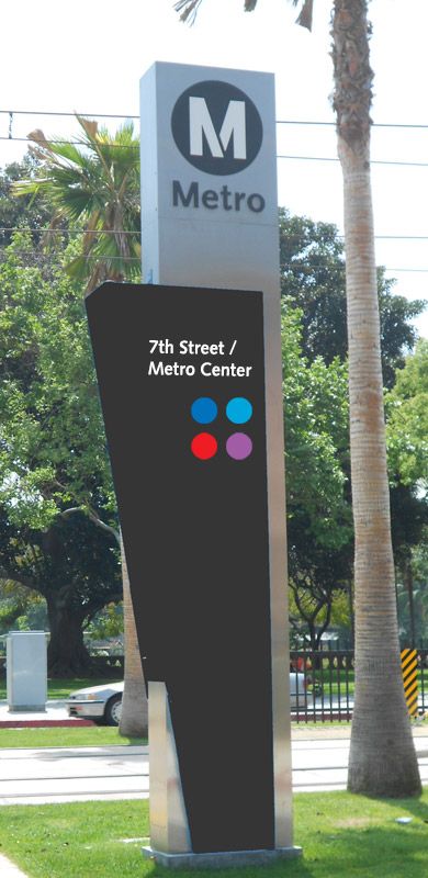 |
|
|
|
Post by transitfan on May 17, 2012 6:42:12 GMT -8
Great idea!  |
|
|
|
Post by thanks4goingmetro on May 17, 2012 10:44:52 GMT -8
There should be a wayfinding sign at 7th Street in the form of the East Portal Union Station Red/Purple Line entrance. I'm all for a neutral color for the pylons considering the eventual departure of color line/route names
|
|
|
|
Post by James Fujita on May 17, 2012 13:43:20 GMT -8
I seem to recall that before Metro switched to the current pylons, 7th/ Metro Center had an old-style pylon with a circle divided into two halves, a blue half and a red one. (Sorry, Purple Line fans...). I never thought to take a picture of it, but I'm looking for photos....
No matter what happens after the Regional Connector, there still needs to be colors on the maps.
Therefore, pylons should keep the colors used on the maps, in some form or another. Edit: I like Elson's pylon idea.
|
|
|
|
Post by ieko on May 17, 2012 14:04:52 GMT -8
I seem to recall that before Metro switched to the current pylons, 7th/ Metro Center had an old-style pylon with a circle divided into two halves, a blue half and a red one. (Sorry, Purple Line fans...). I never thought to take a picture of it, but I'm looking for photos.... No matter what happens after the Regional Connector, there still needs to be colors on the maps. Therefore, pylons should keep the colors used on the maps, in some form or another. Edit: I like Elson's pylon idea. It's still there by the 7th/fig elevator |
|
|
|
Post by Elson on May 17, 2012 14:23:05 GMT -8
I seem to recall that before Metro switched to the current pylons, 7th/ Metro Center had an old-style pylon with a circle divided into two halves, a blue half and a red one. (Sorry, Purple Line fans...). I remember those. I believe the Purple Line didn't have an official designation until 2006. In addition to the 3-sided pylon being replaced by the "Wedge" design, that sign would have been outdated anyway. Plus you still have the Wilshire/Normandie and Wilshire/Western stops with the red wedges. Does anyone remember the 1990 Blue Line system maps that had a "Metro Orange Line" going towards the Westside? |
|
|
|
Post by Elson on May 17, 2012 14:26:08 GMT -8
There should be a wayfinding sign at 7th Street in the form of the East Portal Union Station Red/Purple Line entrance. I'm all for a neutral color for the pylons considering the eventual departure of color line/route names I think for even the single-line stations, the wedge should be black, with a single colored circle denoting the line. That way, if the LRT lines get re-designated to a different color (i.e. Expo to Gold) when the Regional Connector opens, only a small part of the sign needs to be replaced, rather than the whole thing. |
|
|
|
Post by ieko on May 17, 2012 16:08:36 GMT -8
There should be a wayfinding sign at 7th Street in the form of the East Portal Union Station Red/Purple Line entrance. I'm all for a neutral color for the pylons considering the eventual departure of color line/route names I think for even the single-line stations, the wedge should be black, with a single colored circle denoting the line. That way, if the LRT lines get re-designated to a different color (i.e. Expo to Gold) when the Regional Connector opens, only a small part of the sign needs to be replaced, rather than the whole thing. It wouldn't matter, the pylons need periodic replacement due to vandalism anyway. |
|
|
|
Post by Elson on May 10, 2013 16:10:59 GMT -8
Well, well, well...Looks like someone at Metro has been reading this thread, because I was at the Civic Center station recently, and look what I saw - a new station pylon that seemed to adopt my design idea -- a black wedge instead of a colored one, with colored circles below the station name denoting the lines the station serves... 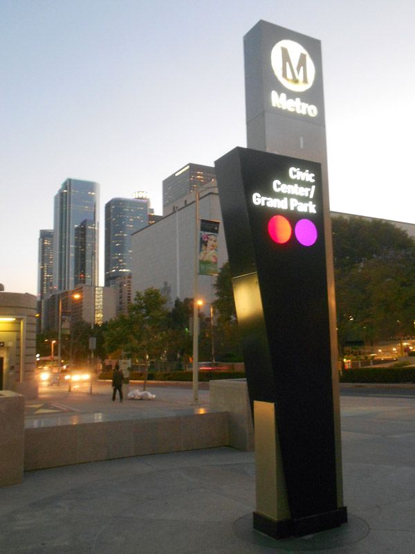 And here was the design I posted last year: |
|
|
|
Post by rubbertoe on May 11, 2013 5:56:27 GMT -8
Elson,
Well done! It's hard to tell from the pictures, but are the colored circles backlit?
RT
|
|
|
|
Post by Elson on May 11, 2013 10:15:02 GMT -8
Elson, Well done! It's hard to tell from the pictures, but are the colored circles backlit? RT Yes they are! |
|
|
|
Post by bzcat on May 28, 2013 11:00:57 GMT -8
Elson's design really was great and user friendly. I'm not surprised that Metro decided to use it. I guess we will never be able to confirm if they got the idea from reading this forum.
|
|
|
|
Post by Elson on May 29, 2013 21:13:28 GMT -8
Elson's design really was great and user friendly. I'm not surprised that Metro decided to use it. I guess we will never be able to confirm if they got the idea from reading this forum. All of you here are my witnesses on this one, lol! |
|
|
|
Post by skater on Mar 3, 2014 10:20:45 GMT -8
Here is the NoHo pylon - they are including the square for the orange line BRT. Hopefully, though they will keep the ful colored wedge for stations that only serve one line. The new pylons seem to be rolled out as gradually, as many changes to signage are done.  |
|
|
|
Post by joshuanickel on Mar 3, 2014 16:30:57 GMT -8
Here is the NoHo pylon - they are including the square for the orange line BRT. Hopefully, though they will keep the ful colored wedge for stations that only serve one line. The new pylons seem to be rolled out as gradually, as many changes to signage are done. That does not seem to be the case. I saw a picture not too long ago of one of the green line pylons in the new look. It appears to be happening system wide. I imagine that the Expo Phase 2 and Foothill Gold Line will have the same design when they are done. Here is the Hawthorne Green Line Pylon:  Source Source |
|
|
|
Post by skater on Mar 3, 2014 20:59:43 GMT -8
^ I see. actually, now that you shared it, I vaguely remember seeing this exact Hawthorne pylon about half a year ago with the new design. In my opinion, the new black with colored dots is great for transfer stations (I'm looking forward to seeing the one for 7th street), but for regular stations the old look with the solid look was best. I was looking forward to seeing a solid purple one at Wilshire/western, but well it seems they have decided to use the same style for all stations.
another poster mentioned above that the pylons need periodic replacement due to vandalism anyway... I don't think this is very often... at many stations the pylons have evidence of having been tagged and the repainted. and the wilshire/western station has had a red pylon until very recently and has been known as the purple line since 2006.
|
|
|
|
Post by joshuanickel on May 9, 2014 10:22:46 GMT -8
^ I see. actually, now that you shared it, I vaguely remember seeing this exact Hawthorne pylon about half a year ago with the new design. In my opinion, the new black with colored dots is great for transfer stations (I'm looking forward to seeing the one for 7th street), but for regular stations the old look with the solid look was best. I was looking forward to seeing a solid purple one at Wilshire/western, but well it seems they have decided to use the same style for all stations.another poster mentioned above that the pylons need periodic replacement due to vandalism anyway... I don't think this is very often... at many stations the pylons have evidence of having been tagged and the repainted. and the wilshire/western station has had a red pylon until very recently and has been known as the purple line since 2006. It appears the style will be consisant through out the system. Here is the one at Wilshire/Western:  New Signage - Yelp New Signage - Yelp |
|