|
|
Post by Elson on Jun 8, 2005 2:31:53 GMT -8
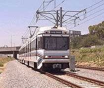 Old school blue stripes w/ red accent (1990-2001) 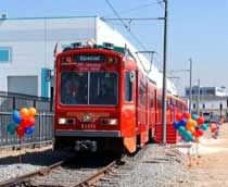 Pacific Electric / 10th Anniversary (2000) 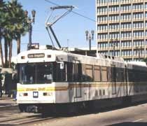 White and black with gold stripe (2001-Present) 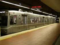 Experimental silver with white stripe (2005- 2007) 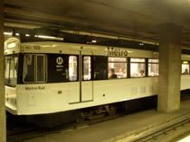 Newer black-on-white "Panda" scheme (2007-Present) |
|
|
|
Post by James Fujita on Mar 12, 2007 12:40:13 GMT -8
this is both a test post and a response to the poll  I actually liked the original color scheme when it first came out, I hoped that they would give the green line a similar green stripe, etc. etc. and then when the green line opened with the blue stripe trains, I was like "wait, what?" in retrospect though, they do look dated/ I also liked the retro paint job, but I do think it would be too much to paint the whole fleet that way. (especially the newest ones, they wouldn't work at all in Pacific Electric retro colors) something about me just doesn't like the yellow stripe paint job. can't explain it, just don't. so, silver wins by default. I guess it is sufficiently "rail transit-y" to me without offending the senses too much. I've seen what other cities have done and personally, I think we could do better. but it works. how about silver with a solid blue stripe? |
|
dane
Junior Member

Posts: 59
|
Post by dane on Mar 12, 2007 13:02:22 GMT -8
Silver is OK by me. If it's low maintenance I say go for it!
|
|
|
|
Post by bobdavis on Mar 13, 2007 23:06:02 GMT -8
Gotta go with the PE paint job (being a major nostalgiac who grew up with Red Cars) but admittedly it's probably more complex to apply than the plainer ones. SF Muni has a fleet of PCC's in many different color schemes, but the Blue Line doesn't cater to tourists or railfans.
|
|
|
|
Post by bluelineshawn on Mar 23, 2007 21:02:37 GMT -8
how about silver with a solid blue stripe?I like that idea. Silver with the white stripe is just too plain. Red is too San Diego. The yellow stripe is too Metro Bus, and the blue stripe is too retro. 
|
|
|
|
Post by wad on Mar 23, 2007 23:47:49 GMT -8
At this point, just coat it in a big McDonalds angus burger wrap.
|
|
|
|
Post by LAofAnaheim on Mar 24, 2007 10:09:02 GMT -8
At this point, just coat it in a big McDonalds angus burger wrap. Heck, I wouldn't mind. The MTA needs cash to operate. If we don't wrap it in advertising, let's find other ways to make up its structural deficit. |
|
Mac
Full Member
Posts: 192
|
Post by Mac on May 1, 2007 17:44:27 GMT -8
lol might as well. make money, and make people hungry, well i think that would be a bad thing for me.
|
|
|
|
Post by Jason Saunders on Jun 12, 2007 13:32:09 GMT -8
I'm of the opinion that our rail cars should be a vibrant and positive color. Such a color will associate a positive impression with the rail cars. While the gray is an improvement over the white scheme, which was frankly boring and uninspired, it is still a bit melancholy and industrial feeling.
|
|
|
|
Post by Transit Coalition on Jun 12, 2007 17:35:11 GMT -8
Jason: The last time I checked, the new rail car fleet is Pantone 877 Silver, not gray. Personally, I really like Silver and the fleet looks a lot better than the past color schemes.
|
|
|
|
Post by mattapoisett on Jun 13, 2007 7:59:24 GMT -8
I am from Boston and I still am fond of the Color of the car is the color of the line. Purple cars for Purple lines. I understand why this is less than practical, like a lot of things in Boston are, but it would make it easier to determine what train you are boarding .
|
|
|
|
Post by James Fujita on Jun 13, 2007 9:13:03 GMT -8
there's nothing particularly impractical about color-coding your train cars, you just would have to be diligent and consistent about doing it. Boston isn't the only city that does that.
the MTA color-codes their buses- red for rapid, orange for local- and somehow they manage to make it work.
when the Expo Line is finished and especially once the downtown connector is built, it will get trickier because you will have separate rail routes sharing the same tracks, but that's all the more reason to want to have easy ways of identifying a train as a Blue Line or a Gold Line train.
|
|
|
|
Post by antonio on Jun 14, 2007 2:30:00 GMT -8
However, color coding the trains will create an inflexibility in switching over rolling stock, esp. once the DTC opens. Its a great idea if your system is as small as Boston's (which has the unfortunate distinction of having 4 different kinds of rolling stock for 4 different lines) with as few lines as it has but not when we plan on expanding our system, both heavy and light rail, and especially not after the 150 new breda LRVs. It worked fine in the Mid-90s when each line had its own color stripe but that was when we had 3 lines. In 3 years we will have 6 and the DTC can make for numerous routings.
|
|
|
|
Post by James Fujita on Jun 14, 2007 7:43:57 GMT -8
I must admit, I'm not entirely convinced that color-coding is right for Los Angeles. once the downtown connector gets built, then we may want to re-think the whole Blue Line/ Gold Line thing. however, just for the record, you don't necessarily need a small system to color-code trains. Tokyo has a ginormous system and they do a pretty good job of color-coding their trains. sometimes you will find a train that isn't properly color-coded in the tunnels, but those are the ones that go all the way out to the suburbs (and beyond) of course, there's no linkage between the lines in Tokyo like there will be here. most light rail systems that I can think of don't color-code; but it might work with the Red Line/ Purple Line. you'll never see a Red Line train in Long Beach, so you'd just have to divide up the fleet and make sure that the red-colored trains go to North Hollywood and the purple ones go to Wilshire. eliminate all of the "is this train going to Hollywood?" questions at 7th/Metro  |
|
|
|
Post by roadtrainer on Jun 16, 2007 11:04:37 GMT -8
|
|
|
|
Post by neyojii on Jun 20, 2008 17:50:04 GMT -8
Old school of course, I think they need to bring it back, instead of having these boring colors they have now.
|
|
|
|
Post by wad on Jun 21, 2008 4:55:26 GMT -8
the MTA color-codes their buses- red for rapid, orange for local- and somehow they manage to make it work. Except for the fact that once Metro runs out of the right colors, you start seeing orange buses on Rapid lines and red buses on locals. Or, in the case of the Harbor Transitway buses, which are theoretically express (blue), there are parts where the buses act as local lines yet they receive red Rapid buses. |
|
|
|
Post by James Fujita on Jun 22, 2008 12:39:38 GMT -8
the MTA color-codes their buses- red for rapid, orange for local- and somehow they manage to make it work. Except for the fact that once Metro runs out of the right colors, you start seeing orange buses on Rapid lines and red buses on locals. Or, in the case of the Harbor Transitway buses, which are theoretically express (blue), there are parts where the buses act as local lines yet they receive red Rapid buses. there may be some flaws in the way that the MTA does things, but color-coding is still a better system than not color-coding. if we had enough buses or enough light rail vehicles or subway cars in the first place, "running out of colors" wouldn't be an issue. I know a lot of my recent posts have been of the "if other cities can do..." variety, but in all honesty, it really would make the system work better. |
|
|
|
Post by bluelineshawn on Jun 22, 2008 15:51:32 GMT -8
We could color code the heavy rail cars, but color coding the lrv's would be problematic. We can always expect that trains that run on surface streets will have some slight delays unless the schedules are really generous. Metro will run 3-car Expo trains so that they can be switched to the blue line if necessary and will likely have that same flexibility for the other lines once the connector is open. We need better signage, but color coding would decrease our flexibility.
|
|
|
|
Post by roadtrainer on Jun 23, 2008 8:17:38 GMT -8
A new color scheme is good about every 10 years, I can remember a green line train with big green decals saying Metro Green line is coming! It looked really Sharp! I am still awaiting a green line train to be painted up like the original MTA two tone green (pre RTD days). If I had the extra money I would fund it myself. Many some day one of the TTC members will win the lottery and fund the paint job. Sincerely The Road trainer |
|
|
|
Post by wad on Jun 25, 2008 3:08:55 GMT -8
there may be some flaws in the way that the MTA does things, but color-coding is still a better system than not color-coding. Before color-coded buses came along, there was another way to allocate vehicles to lines and riders could still tell the difference. They're called headsigns. The issue is a matter of painting oneself into a corner. If Metro wants to maintain strict adherence to color-coded equipment, it must tie up more vehicles in reserves to ensure they go to the "right" services. |
|
|
|
Post by James Fujita on Jun 25, 2008 14:53:11 GMT -8
there may be some flaws in the way that the MTA does things, but color-coding is still a better system than not color-coding. Before color-coded buses came along, there was another way to allocate vehicles to lines and riders could still tell the difference. They're called headsigns. The issue is a matter of painting oneself into a corner. If Metro wants to maintain strict adherence to color-coded equipment, it must tie up more vehicles in reserves to ensure they go to the "right" services. are you saying that color-coding trains is a bad idea, or just that the MTA lacks the resources to do so? because I'll concede that color-coding isn't necessary, and perhaps with a light-rail based system like ours, it might be difficult to implement such a system. but I think the Red Line/ Purple Line would benefit from color-coding, and maybe even our light rail lines. expensive, perhaps. a bad idea? no. quick question: without looking at the headsign, which rail line is this rail car on?  |
|
|
|
Post by JerardWright on Jun 25, 2008 15:36:40 GMT -8
It also helps in Boston's system that every rail line uses a different set of equipment.
The Red Line uses 10'6" wide and 70-75' long subway cars
The Blue Line uses 9'0" wide and 48' long trains
The Orange Line uses 9'4" wide and 65' long trains.
However, I don't disagree with that sentiment, but there's one problem with that assumption and it's the exact same one we are running into with our color coded buses. That is when rail vehicles break down and when that one vehicle breaks down it musses up the entire organization of it because you sometimes come with a mixed consist of a red and purple subway car. Talk about confusing!
I believe the problem with our subway cars is that for a 75 long train there's only one exterior side headsign and no interior headsigns! These headsigns should be located by or near every door for quick reference. If you notice the new Breda LRV's understand that little issue and will have 2 destination signs per LRV.
Also our headsigns should have color to them, in DC there's a large colored line at the front and end of the destination sign so it quickly identifies which line the train is running on. Or decide on giving the trains a route letter or number associated with them like they have on the NYC, SF Muni Metro and Denver's growing system.
|
|
|
|
Post by metrocenter on Jun 25, 2008 15:40:40 GMT -8
Trains should be easily identifiable by color. At the same time, trains ought to be easily interchangeable between lines. These needs aren't mutually exclusive.
SF Muni used scrolling headsigns on the front, sides and interior of every train. Colors could surely be accomodated on those signs.
In the digital age, this can be accomodated by colored LED headsigns. The sign could show a block of green next to the words "Green Line", for example.
And I agree with Jerard: these trains should have more headsigns. You don't even need colors if there is always a clearly legible sign facing you.
In London, the poles for holding on inside the trains are the color of the route. It doesn't take too much to repaint or resticker a pole with a different color.
I am wary about different paint schemes, because like I said, trains should be usable on different routes.
|
|
|
|
Post by wad on Jun 26, 2008 4:15:56 GMT -8
are you saying that color-coding trains is a bad idea, or just that the MTA lacks the resources to do so? Trains are actually a better place to color-code -- think Boston -- than buses. The subway would be an exception. Right now, Metro has trains alternating destinations once they get to Union Station; a Red Line train goes outbound as a Purple Line train and vice versa. |
|
|
|
Post by bluelineshawn on Jun 26, 2008 9:48:58 GMT -8
Metro has indicated several times that they will abandon the color based line designations for letters or numbers in the not too distant future. Also while I agree 100% that our trains need more visible signage, we get so much more flexibility on shared lines with something less permanent than painted trains. And you can't really compare it to buses. It's not like each bus line has a different color. The colors are for levels of service, not individual lines.
|
|
|
|
Post by James Fujita on Jun 26, 2008 14:51:04 GMT -8
just a couple of thoughts:
1) as far as color-coding is concerned, I don't really care so much about the buses and the light rail lines as I do about the subway. when half your trains are headed west towards the ocean or at least Century City (eventually) and half are headed towards North Hollywood (or beyond?), we might want to look at colors.
[ as for "but the trains might get mismatched if there's an accident," let the MTA worry about that part. that's arguing from an exception to the rule, rather than the general principle, which is a transit system should be able to keep their trains straight. ]
somehow, the conversation got off on the wrong track (ho ho) and we got talking about rapid buses instead. honestly, they can do whatever they want with the buses, I don't care.
2) that said, color-coding is actually a pretty neat trick for the buses IF the MTA would just be consistant about it. I mean, to look at a bus from a distance and say "oh look, that bus is red, it must have fewer stops and theoretically be slightly faster than that other bus over there which is clearly painted orange" is not a bad thing. it's no different than looking at a red soda can and thinking "Coke" and a blue can is "Pepsi"
3) I can see how, with the light rail lines, color shouldn't matter. in the future, I think you will see trains starting in Azusa or Pasadena that will eventually find their way south to Long Beach or Santa Monica or what have you, and if that becomes the case, then color may become irrelevant.
4) at the same time, I kinda sorta hope that colors remain relevant. we're still a city of first-time "gas is too expensive" transit customers, and if those Freshman riders are to become Sophomores, we want them to understand the system. color-coding is one of those mnenomic things, much more so than letters or numbers, especially when it comes to maps.
"you take Line A to Pico..." "which one is Line A?" "it's the blue-colored line on the map" "oh. so why don't you call it the Blue Line?"
I'm going to keep returning to Tokyo in my comments, because you don't overlook an 800-pound gorilla with 13 subway lines and a gazillion subway passengers can't all be wrong. each line has a name, each name has a color on a map and a color on signs and yes, the trains are color-coded, each station has a number and each line has a letter. THEY DO EVERYTHING, and it works great. they didn't "phase out" the names or the colors when they added the letters and numbers.
anyhoo... I've got to get to work... if anybody wants to disassemble my comments, you have several hours before I'm able to fight back ;D
|
|
|
|
Post by JerardWright on Jun 26, 2008 16:19:42 GMT -8
just a couple of thoughts: 1) as far as color-coding is concerned, I don't really care so much about the buses and the light rail lines as I do about the subway. when half your trains are headed west towards the ocean or at least Century City (eventually) and half are headed towards North Hollywood (or beyond?), we might want to look at colors. [ as for "but the trains might get mismatched if there's an accident," let the MTA worry about that part. that's arguing from an exception to the rule, rather than the general principle, which is a transit system should be able to keep their trains straight. ] somehow, the conversation got off on the wrong track (ho ho) and we got talking about rapid buses instead. honestly, they can do whatever they want with the buses, I don't care. In principle, I don't think anyone would disagree with that. In application is a whole other issue and when talking about a multimodal transit system that is an essential part of the conversation. Branding. To differentiate two completely different products. How does MTA brand it's Rail services? I agree with you on that case, but when another part of your rail system doesn't have that same mneonic as the painting of those trains, doesn't that throw the rail system organization out of the window and create confusion to those sophmore riders? I don't know. Chicago has those same changes flipping between Color and Line Name and it's fine. The only time they "painted" the trains was when they introduced the new Pink Line, since that brief introduction they use the regular trains but they have plenty of colored destination signs and station wayfinding signage in that color to keep the consistency. Plus they get a nice little bit of advertising revenue with wrapping their train cars with ads. NYC is in a similiar boat because of mulitple lines running on local and express tracks and about every 2 to 3 years, they adjust the subway services to take a different routing/path. A lesson that we can learn from NYC is that they emphasized an organizational mneonic hierarchy. Which one takes greater precedent when routing/coloring/naming our train lines? |
|
|
|
Post by masonite on Jun 26, 2008 16:26:45 GMT -8
just a couple of thoughts: 14) at the same time, I kinda sorta hope that colors remain relevant. we're still a city of first-time "gas is too expensive" transit customers, and if those Freshman riders are to become Sophomores, we want them to understand the system. color-coding is one of those mnenomic things, much more so than letters or numbers, especially when it comes to maps. "you take Line A to Pico..." "which one is Line A?" "it's the blue-colored line on the map" "oh. so why don't you call it the Blue Line?" I'm going to keep returning to Tokyo in my comments, because you don't overlook an 800-pound gorilla with 13 subway lines and a gazillion subway passengers can't all be wrong. each line has a name, each name has a color on a map and a color on signs and yes, the trains are color-coded, each station has a number and each line has a letter. THEY DO EVERYTHING, and it works great. they didn't "phase out" the names or the colors when they added the letters and numbers. ;D Good points. The way it is now is confusing for first time user to say the least. Distinguishing between the purple line and red line is difficult to say the least as there is only a small sign on the side of the trains distinguishing between the two with no announcement and no message on the boards (at least this was the case last week when I rode, although some have reported that they are now showing next time trains and destination - a huge improvement on the boards in the subway stations). I still prefer the London model, which is the world's largest subway and city rail network. Give each line a color on the map but also give it a name and at each stop have an announcement say this is so and so line bound for so and so destination. For LA, assuming the DTC is in place, this would mean the Purple Line would be the "Wilshire Line", the Red Line would be the "Hollywood Line", the SM to East LA light rail line would be the "Expo Line", the Azuza to Long Beach Line would be the "Pasadena Line". The Crenshaw Line would of course be the "Crenshaw Line". This would really help novice users of the system as I was just at home in London in 1 day as I am in Los Angeles. At every stop, there would be an announcement on the train - this is the Wilshire Line bound for Union Station or this is the Hollywood Line bound for North Hollywood. This would be especially important in DTC stations and where the current Red and Purple Lines overlap. Overall, relatively easy to implement and low cost and it makes the system easier to navigate for newbies, especially if we can grow the system. Probably never happen, but I was always a big proponent of giving the Wilshire District branch of the Red Line a separate designation and the Purple Line was finally born, because this is what made sense so you never know. |
|
|
|
Post by masonite on Jun 26, 2008 19:44:14 GMT -8
To be consistent with the methodology of the naming conventions, I would probably reconsider "Pasadena Line" for Long Beach Line. One reason is that Long Beach is a major destination of the line, but more importantly and to be consistent, the line runs along Long Beach Blvd. for much of its length. Another idea might be Arroyo. This line is probably the toughest one to name.
|
|


 ?
? 


