|
|
Post by rubbertoe on Jul 20, 2009 13:47:38 GMT -8
All, I recently started a thread in the Gold Line extension forum that shows the Gold Line ridership for the last 5 years. My idea was to show over time how the ridership increased based on the opening of the Eastside extension. Since the Red Line is the only other rail line that the Gold Line connects directly to, I thought it would be good to also track how the Red Line ridership increases once the extension is open. Below you will find the Red Line ridership graph, also showing LA County gas price for each month. In the future I will post thumbnails to the updated monthly graphs so that the page will load faster, and those interested in seeing the full size graph can click it to see a larger image. The Red Line ridership doesn't track gas prices as closely as the Gold Line ridership does. For example, the Aug-Sep 2005 spike didn't increase Red Line ridership, while it did so with the Gold Line. This could have had something to do with bus line rerouting that feeds the Gold Line, but I don't track that so I don't have any way of knowing if that were the cause or not. The July 2008 gas spike did indeed cause all the LA County rail lines to peak. The increasing ridership over the 5 year period is also common to all the rail lines, which is good. RubberToe  |
|
|
|
Post by spokker on Jul 20, 2009 17:32:16 GMT -8
The variance in Red Line ridership cannot be fully explained by gas prices alone. As with most transit systems, some of the ridership peaks and valleys can be explained by the normal variation between summer and winter.
Also, Red Line ridership tends to hold its own against gas prices because it is simply fast and convenient for travel to/from Hollywood and Downtown.
There is this notion that people may "resort" to mass transit because of high gas prices, but the Red Line bucks the trend as it is able to retain a lot of ridership even when gas prices go back down.
For example, start at Feb. 08 ridership. Consider that gas prices and ridership hit a peak in Jul. 08.
Now fast forward to Jan. 09 when gas prices were below $2/gallon. Red Line ridership was still higher than it was in Feb. 08, even counting the normal winter dip.
The Red Line was able to retain ridership despite low gas prices. In essence, riders came to the Red Line because of high gas prices, but stayed for the fact that the subway is a viable alternative to the car.
|
|
|
|
Post by bluelineshawn on Jul 20, 2009 18:32:39 GMT -8
Thanks and yes keep updating your graphs and post them here. You might want to add an indicator for when there were fare increases. Maybe a dashed line or something.
The increase in ridership on the red line has been noticeable. It appears to be almost all on the red line and not the purple which seems more or less the same as it was 2-3 years ago.
|
|
|
|
Post by masonite on Jul 20, 2009 20:01:39 GMT -8
Thanks and yes keep updating your graphs and post them here. You might want to add an indicator for when there were fare increases. Maybe a dashed line or something. The increase in ridership on the red line has been noticeable. It appears to be almost all on the red line and not the purple which seems more or less the same as it was 2-3 years ago. Not sure where you are getting figures for the Purple Line. What the MTA shows is a combined Purple/Red Line ridership, which makes sense since the Purple Line is the same as the Red Line except for the Western and Normandie stations. I think the more rational explanation for the increased subway ridership vs. other forms is due to the fact that there has really been a lot of development around the stations all along the route. That just hasn't been the case with our light rail lines for the most part. Yes, the Blue line has a little bit on its ends and the Gold Line has had a tiny bit as well on a few stations, but that is pretty much it. Also, the subway can easily handle increased passengers. That isn't the case with the Blue Line. When I worked downtown a dozen years ago, people were complaining how overcrowded the Blue Line was and some were shunning riding on it based on that fact. I can't recall if this was before the 3 car trains, but even that improvement has likely been used up in that time frame. |
|
|
|
Post by bluelineshawn on Jul 20, 2009 21:39:25 GMT -8
I honestly don't understand what's not clear, but I'll try to expand. I know that the ridership stats are for the combined red/purple lines. My point was that the that purple line trains appear to have about the same ridership as they did two years ago. OTOH the red line trains have noticeably more riders. While the trains do substantially overlap, those headed towards Hollywood and beyond don't take the purple line, so I'm guessing that the riders headed to that area has increased (even as the Orange line ridership is flat).
The ridership increase could be because of the TOD's and other housing or it could be due to a variety of reasons, like people becoming more green. Dunno. Either way it's fantastic!
And yes the subway can handle even more, although with another 20-40K they might have to look at slightly increasing the service level.
|
|
|
|
Post by spokker on Jul 20, 2009 22:09:14 GMT -8
I agree. I ride to Wilshire/Western very often and it's easy to get a seat on Purple Line trains. Sometimes I ride the Red Line to Wilshire/Vermont just for kicks and then transfer to a Purple Line train, and it's much more difficult to get a seat on trains bound for North Hollywood.
If the Purple Line trains ever go to Santa Monica, that would change.
|
|
|
|
Post by rubbertoe on Jul 21, 2009 5:19:32 GMT -8
Bluelineshawn,
Would you or anyone else happen to know the fare increase history? That would be easy to add as individual dashed lines as you suggest.
RT
|
|
|
|
Post by Justin Walker on Jul 21, 2009 7:26:42 GMT -8
Bluelineshawn, Would you or anyone else happen to know the fare increase history? That would be easy to add as individual dashed lines as you suggest. RT From the Transit Coalition past action page:  |
|
|
|
Post by bluelineshawn on Jul 21, 2009 9:43:48 GMT -8
As seen from the chart above, fare increases are complicated so you'll probably only be able to indicate that there was an increase without really quantifying the amount. Also that chart is missing the one that we last had in mid 2007. They postponed the 2009 increase when Measure R passed, so I guess we'll see that in 2010.
|
|
|
|
Post by rubbertoe on Aug 13, 2009 14:52:54 GMT -8
The MTA just released the July 2009 data. When updating my spreadsheet I found that for all the rail lines, that the July 2008 numbers were off for some reason, but the July 2007 numbers agreed. I went ahead and updated my July 2008 numbers, so the spike previously in 07-08 came down somewhat. I decided to add a couple things to the chart too. I show the last months ridership above the last column, and the Red line set a record with 162,720 average daily weekday boardings! I also saw that the Orange line opened up in November of 2005, so I added a label for that column too. While there is an increase after that starting in 01-06 to 05-06, gas prices were rising at the same time so it isn't really conclusive if the Orange line opening is what drove the higher Red Line numbers. Given the fact that the Orange Line terminates at the Red Line, you would certainly think that some of the increase was due to the Orange Line opening up. Gas prices continue to creep up too, now nearing $3.00 as of the first week of July, so that is likely driving the current record numbers. RubberToe  |
|
|
|
Post by metrocenter on Aug 14, 2009 7:40:20 GMT -8
^ Prices are now nearing $3.00 as of the first week in August (not July).
It is usually not possible to directly attribute subway ridership to a single cause, such as gas prices. There are many factors, both individually and at a macro level, for why people will choose to take or not take the train. Only when something catastrophic happens (sudden doubling of gas prices, earthquake) can one say with any confidence that a shift has clearly been 'caused' by something.
Having said that, I do appreciate the statistics and the chart. There is a clear trend over the years of more and more people accepting and using the subway. An interesting exercise might be to extrapolate the data and predict when ridership might pass the 200,000 mark.
|
|
|
|
Post by metrocenter on Aug 14, 2009 7:57:31 GMT -8
I created a simple (not terribly accurate) trend line, and observe that ridership has increased by 20,000 every 18-24 months. We are currently appx. 38,000 riders shy of 200,000. Naively, I could draw that line out and predict the Red Line hitting 200,000 somewhere between 34-44 months from now (between June 2012 and April 2013).
Predictive value: minimal. I guess we'll know four years from now, whether or not this prediction is correct.
|
|
|
|
Post by rubbertoe on Aug 18, 2009 7:14:19 GMT -8
Metrocenter, The $2.96 price was for the first week of July. I use the regular reformulated retail price for the first week in the month as posted in the EIA Los Angeles data here: tonto.eia.doe.gov/dnav/pet/hist/mg_rr_l5w.htmThe August price dropped slightly to $2.93. Editing the downloaded table took about an hour the first time, but just updating it monthly now is a breeze. I think you may be onto something with your observation in the Gold Line thread about the summer traffic being down on the 110 and 105 leading to the poor ridership on the Gold and Green lines. RT |
|
|
|
Post by metrocenter on Aug 18, 2009 7:55:50 GMT -8
^ rubbertoe, my bad. I misunderstood your statement about gas prices.
|
|
|
|
Post by masonite on Aug 23, 2009 20:05:29 GMT -8
The Red Line continues to soar in ridership, while the Gold Line continues to be a major disappointment 6 years after it opened (hopefully this will eventually change with development around the stations and the DTC as I don't think the Eastside Gold will have much effect at least on this segment of the Gold Line).
The Red Line has gone from the ugly stepchild of the Metro system to its superstar in its short lifetime as development around its stations and overall stronger neighborhoods around the stations as well (part of this is due to the Subway itself IMO) have allowed it to carry many more riders than all of the other 3 rail lines put together.
Just think if we had instead of this secondary route (a strong secondary route, but still secondary) that competes directly with a freeway, a cross-town line that covered much of the employment base in the city including areas that are miles from the freeway that would complement Metrolink trains coming from farther East (Riverside and San Bernadino) and Southeast (OC).
Any guesses on that ridership?
|
|
|
|
Post by rubbertoe on Oct 1, 2009 17:13:07 GMT -8
August numbers just released. The 7 month trend of increasing ridership that led to the record July number finally ended. August ridership dropped down to 158,305. Note that the level is still about 5% up from the year ago levels. This is quite good considering all 3 other rail lines are down year over year. That isn't surprising, in that we had the gas spike right around this time last year. With any luck, the Gold line Eastside Extension should start adding somewhat to the Red Line numbers starting in (hopefully) November.  |
|
|
|
Post by rubbertoe on Nov 9, 2009 10:16:34 GMT -8
September numbers are out. We are now down below the 150,000 level, essentially unchanged from year ago levels. Gas prices ended up at an even $3.00 as of September 1st. RT 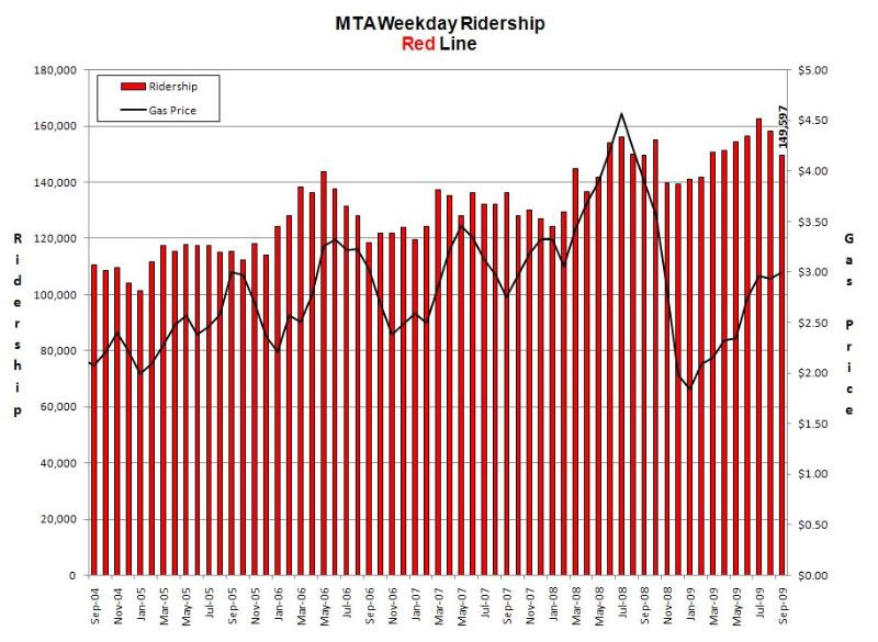 |
|
|
|
Post by spokker on Nov 9, 2009 15:30:12 GMT -8
Hey, it was a good Summer  |
|
|
|
Post by rubbertoe on Dec 7, 2009 13:51:26 GMT -8
October numbers are out. Yikes, down from 160k to about 140k in 3 months. You would think it had something to do with the recession, but the ridership was going up into August. And the recession was going on then too...  |
|
|
|
Post by Jason Saunders on Dec 7, 2009 14:20:58 GMT -8
October numbers are out. Yikes, down from 160k to about 140k in 3 months. You would think it had something to do with the recession, but the ridership was going up into August. And the recession was going on then too... It's seasonal as reflected in your graph of previous years. My guess is weather. |
|
|
|
Post by kenalpern on Dec 7, 2009 22:19:41 GMT -8
Based on the economy and ridership generators, this will not go up significantly until new links in the system are created. Perhaps the Eastside LRT, perhaps the Expo LRT, and perhaps other links, will make this go up.
|
|
|
|
Post by rubbertoe on Dec 30, 2009 17:20:46 GMT -8
November numbers are up. I was expecting to see some level of increase due to the Gold Line opening, but we instead saw a small drop from the previous 141,302 down to 139,140. The drop was 2,162. Though I don't post the Blue and Green they were down about 1,300 and 200 respectively. It may take a couple months for any real effect to be noticeable. And I posted on the other thread that maybe the November numbers are averaged over the whole month, and don't fully show the increased ridership. The % decline from one year ago is essentially flat, while the Blue and Green are both down >4%. 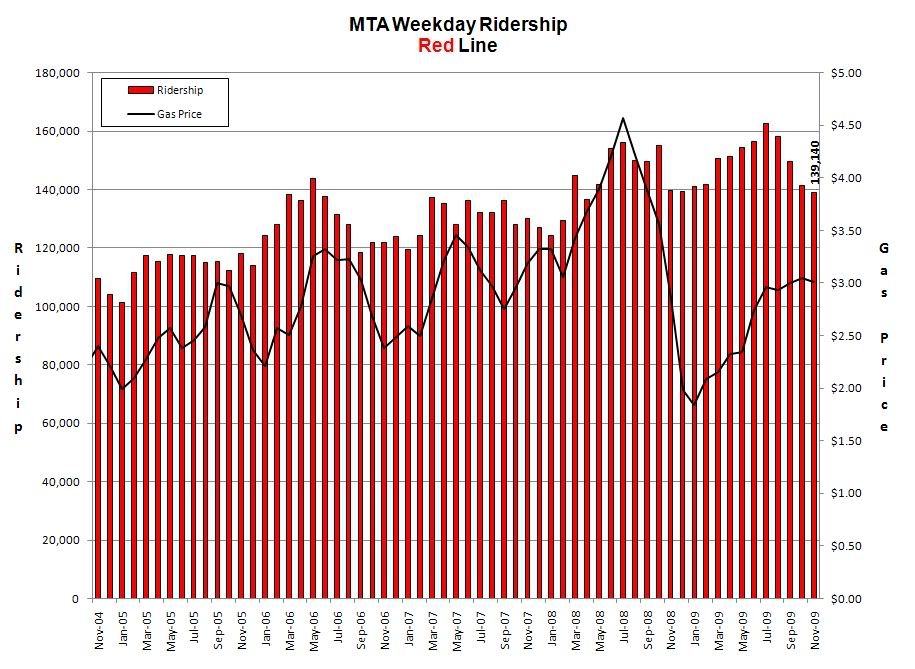 RT |
|
|
|
Post by rubbertoe on Feb 1, 2010 12:44:44 GMT -8
December numbers are up. We are now at 5 straight months of declining ridership. Haven't seen this happen previously in the data that I have which goes back to April 2004. There is often a dropoff going into the winter, and we will see if the summer bump arrives as expected. No perceptible increase as far as I can tell from the opening of the Gold Line EE. If you look at the change from October 2009, Green Line is down 6%, Blue Line is down 4.8%, and the Red/Purple Line is down 2.9%. Even given the recent decline, we are only down about 1.4% from year ago levels. 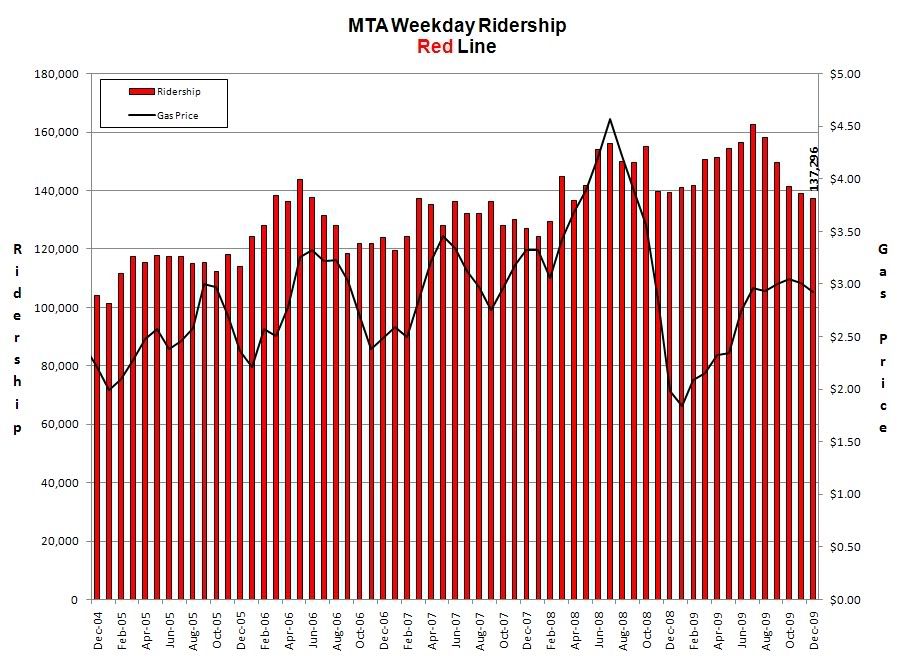 |
|
|
|
Post by bluelineshawn on Feb 1, 2010 22:29:31 GMT -8
Ridership does seem noticeably lower, but like you say that's seasonal. Plus the economy is down and most Metro riders are at the lower end economically and that's the end that fares poorest in a recession. Ridership should bounce back strong whenever the economy recovers, which is hopefully sooner rather than later.
|
|
|
|
Post by rubbertoe on Mar 18, 2010 6:37:30 GMT -8
February numbers are out. Up 5,667 year over year, or 4.0%. Will be interesting to see if the summer peak reaches the all time high set in July 2009 of 162,720. Gas has been pretty stable, but as I noted previously, it generally goes up about $0.90 on average every summer. 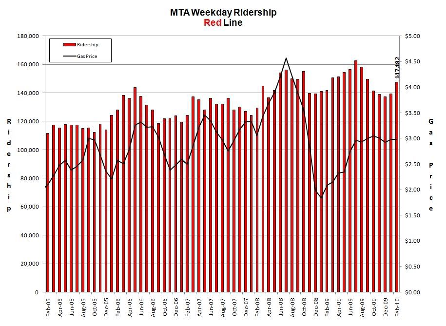 |
|
|
|
Post by metrocenter on Mar 18, 2010 8:27:25 GMT -8
Gas prices have been very stable for nearly a year. I would guess this is due to the economic downturn: fewer people working means less demand for gasoline.
OTOH, transit ridership continues to climb. I would guess this is because more people who have jobs are trying to save money by taking the train/bus to work.
|
|
|
|
Post by spokker on Mar 18, 2010 11:51:32 GMT -8
How does the Red Line's ridership compare to a stretch of freeway in terms of how many people it moves? I doubt we would be able to find the perfect comparison, but how does the Red Line compare to say, the 101 from Downtown to Hollywood, or the 405 from LAX to Westwood?
The busiest sections of the 405 move 200,000 cars per day. We would multiply the rush hour throughput by the average occupancy of a vehicle at rush hour for those hours. And then we would multiple the throughput at all other times by the average occupancy of a vehicle at all other times to get the true number of people moved. I'm guessing here.
It seems to me that the Red Line is holding its own, and with a larger system ridership numbers could rival what the freeways do.
|
|
|
|
Post by trackman on Mar 18, 2010 19:18:14 GMT -8
Rail has more capacity than concrete highways. But to be fair, a railway should only be compared to the equivalent width, or 2 lanes of traffic for 2 tracks.
fwiw, the capacity of one lane of a highway, under free-flow conditions, is approximately 2,000 vehicles per hour. Southern Californians are a bit more effecient... up to 2,500 to 3,000 vehicles per lane per hour under free flow conditions. That's 33 to 50 cars per lane per minute. Assuming 1.5 people per auto,, which I believe is normal, we're talking 3,000 to 4,500 people per hour per lane.
Rail... we know trains can run as close to 2 minutes apart. The Red Line does 10-minutes between trains right now. Right? They run semi-long trains.... 6 cars. Assuming 100 people per car means 600 people per train. That means about 3,600 people per hour per direction.
Highway lane capacity versus Red Line capacity at current service level is pretty comparable... it would seem.
But the Red Line can run many more trains, x5 as much by my count, so the Red Line could top at at around 18,000 people per hour per direction. Right?
|
|
|
|
Post by trackman on Mar 18, 2010 19:21:47 GMT -8
BTW, I once heard that the San Francisco BART Transbay tube carries so many people that it is equivilent to one deck of the Bay Bridge, which is 5 lanes wide.
|
|
|
|
Post by jeisenbe on Mar 19, 2010 4:11:11 GMT -8
Trackman, I have not seen any figures showsing 3000 vehicles per lane per hour is possible in free flow. I believe that would results in stop-and-go traffic. Also, the average vehicle occupancy is closer to 1.2 people per car during the commute hours, I believe.
|
|


