|
|
Post by Elson on Mar 12, 2007 12:49:57 GMT -8
Okay, so now we have a Purple Line... but still subway trains don't show any demarcation on which line they are. I realize Metro needs to budget and phase in maps, signage, etc. But can't they just make red and purple placards for the front of the trains in the meantime?
I'm curious to see what changes we will eventually see regarding the Purple Line. Will there be a separate Purple Line schedule printed? Will the station pylons have a purple wedge? Will there be purple circles in the station signs?
Metro still has not adopted pylon signage for transfer stations!
|
|
|
|
Post by Justin Walker on Mar 12, 2007 15:43:26 GMT -8
Metro has said they don't want to spend the money on new timetables until the next scheduled timetable change. Half of the posted maps are still incorrect, making this a very confusing interim period. The pylons and maps probably will take some time.
|
|
|
|
Post by Transit Coalition on Mar 12, 2007 17:57:26 GMT -8
A really long time ago, 1974, I worked for a director of the Southern California Rapid Transit District. When I first started riding RTD buses, they had this really ugly color scheme of puke brown and burnt orange.  And the RTD had this old school boomerang logo. The paint scheme was recommended by a wife of one of the directors, as it recognized some historical fact. It might have been California Poppies and the Gold Miners.  Later the RTD had an ad agency that recommended that the color scheme be modernized to make the buses more community friendly, with a modern logo. The was one catch. You couldn't just go and repaint 2,200 buses right away, but you had to wait until the bus maintenance cycle called for repainting and that a new bus fleet was being ordered to initiate the color / logo change.  We had this old school politician who screamed, ranted and raved if you wasted even a penny on a better public image or even spent any money to advertise anything. That was County Supervisor Kenneth Hahn who influenced a lot with public transit. Now, flash forward to 2007. The Metro Art Dept. has gotten a lot of great changes authorized. But, our favorite penny pinching Supervisor Zev Yaroslavsky has made sure that the various marketing updates would take a few years to put into effect. Why? Because he didn't want to waste a penny to make it easier for the users. That's Zev. So, over the next two years the components of the Purple Line will roll out, as the replacement maintenance cycle allows. As for schedule, perhaps the schedule will stay unified, but it will be printed in Red and Purple instead of Red and Black. For those that are confused. Just remember that away from downtown LA, some trains go to the Valley and some to Western. Just listen to what the train Operator announces. |
|
|
|
Post by Elson on Mar 12, 2007 20:01:54 GMT -8
And the RTD had this old school boomerang logo. The paint scheme was recommended by a wife of one of the directors, as it recognized some historical fact. It might have been California Poppies and the Gold Miners. Hence that RTD Poppy Orange color still lives on in the 21st century! 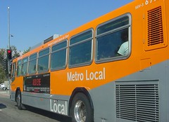 |
|
|
|
Post by Transit Coalition on Mar 12, 2007 20:27:59 GMT -8
I have to say that the density of the current Orange is what does the trick, along with the use of Silver.
I am sure someone here could photoshop the old color scheme with Bright Metalic Gold and Brilliant Orange and that would have fixed the old image of RTD.
|
|
|
|
Post by Elson on Mar 12, 2007 22:30:01 GMT -8
I have to say that the density of the current Orange is what does the trick, along with the use of Silver. I am sure someone here could photoshop the old color scheme with Bright Metalic Gold and Brilliant Orange and that would have fixed the old image of RTD. The color of the buses of the old "Rough, Tough and Dirty" were the least of the RTD's shortcomings! LOL |
|
|
|
Post by bluelineshawn on Mar 15, 2007 21:29:00 GMT -8
Will there be a separate Purple Line schedule printed?
Obviously yes.
Will the station pylons have a purple wedge?
Will the missing red line pylons at 7th/metro center ever be replaced?
|
|
|
|
Post by Transit Coalition on Mar 15, 2007 23:15:28 GMT -8
Lines that share the same path or segment but divert into different branches are normally on the same schedule, so one can figure out the heavy service on the trunk. By naming one branch purple, it was help those who don't understand the branch name: Wilshire / Western. It is just some marketing to clarify things to some users.
|
|
|
|
Post by Elson on Mar 16, 2007 0:04:06 GMT -8
Will the station pylons have a purple wedge?Will the missing red line pylons at 7th/metro center ever be replaced? I think the reason why they have yet to be replaced is because Metro has yet to find a way to color the wedge in a way that reflects the lines that use that station. Do you cut the wedge vertically? horizontally? diagonally? Other transfer stations also do not have a wedge: Union Station (who used to have a pylon on the Gateway side before gateway was built) and Imperial/Wilmington. |
|
|
|
Post by bobdavis on Mar 18, 2007 13:54:52 GMT -8
It's my impression that other than distinguishing Metro from Foothill (or Metro from Santa Monica for those out West), most riders don't give a rat's hat on how the bus or train looks. Whether it's a wooden interurban or a natural-gas-fueled bus, the important things are: Does it run often and on time? Is it clean and comfortable? Is it safe (free from mechanical troubles and hoodlum passengers)? If I'm downtown, can I find the bus to my neighborhood or suburb easily? Will transfer to another line be convenient? All the rest is of interest mostly to transit fans and people with a financial interest (painters, exterior decorators and graphic consultants.)
|
|
|
|
Post by James Fujita on Mar 18, 2007 18:19:10 GMT -8
I'm sure that's true, but in this era of custom car paint jobs, we can't afford to ignore color issues completely.
Not that I would want to see lowrider buses with spinner rims ;D
|
|


