|
|
Post by bluelineshawn on Jul 5, 2007 19:56:14 GMT -8
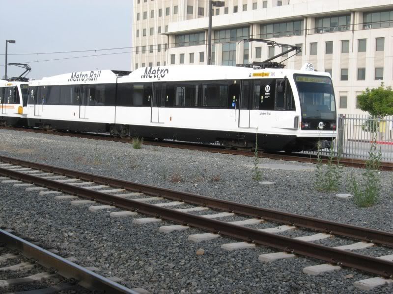
I don't remember if I ever posted this here... A lot like the new blue line scheme. Are they just trying these out or is this where we're headed? Has anyone heard?  |
|
|
|
Post by Tony Fernandez on Jul 5, 2007 21:06:55 GMT -8
It seems so plain, it needs some color.
|
|
|
|
Post by bluelineshawn on Jul 5, 2007 21:16:52 GMT -8
I agree. It looks reminiscent of our buses, but without the color.
|
|
|
|
Post by nickv on Jul 5, 2007 21:51:11 GMT -8
Well, at least it looks consistent with the Blue Line's design and bus fleet, but I too think that the outer appearance is a bit plain. I think some stripes or some other nice design along the side should help. The white background color does however make the train look a little more "professional"; maybe Metro is trying to target professional workers who own cars to use the Gold Line. BART trains are white and have some blue stripes. Metrolink trains also have a white base color.
|
|
|
|
Post by whitmanlam on Jul 5, 2007 23:23:47 GMT -8
Why do they need the words "Metro Rail" painted in big lettering. Do people still confuse it for Metro Link or Metro Bus. Everyone knows it's a Metro train.
|
|
|
|
Post by tonyw79sfv on Jul 5, 2007 23:45:34 GMT -8
The "Metro Rail" painted on the trains is consistent with how Metro plasters the buses like "Metro Local", "Metro Rapid", "Metro Express", and "Metro Liner" for the Orange Line. They're making the trains like the buses. The old train paint schemes are reminiscent of the old "Travel Smart...Take Metro" buses.
|
|
|
|
Post by dasubergeek on Jul 6, 2007 15:25:51 GMT -8
You know, just once it would be nice to have a LARGE identifying mark that says it's the Gold Line. Honestly, it's not such an issue with the Gold Line, but before they redded and purpled the subway, it was hard to tell whether it was a Seoul Train (ha!) or a Valley train.
The thin stripes will be helpful, but sheesh...
|
|
|
|
Post by bluelineshawn on Dec 16, 2007 15:36:36 GMT -8
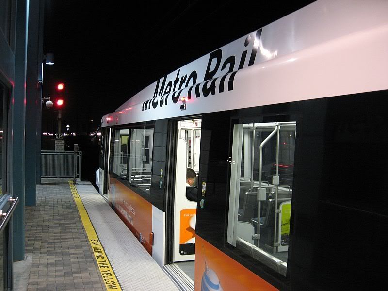
Well here's what it looks like in service. It's hard to even notice that the stripes are missing with the ads on the side.  |
|
|
|
Post by James Fujita on Dec 17, 2007 12:15:42 GMT -8
there's something odd about having those AT&T ads on the trains..... "excuse me, when does this train arrive in New Sanfrandelphia?" ;D
I wonder, if they're going to have ads on the trains, why not have wrap-around ads? I saw a bus the other day with a huge Wachovia Savings ad on the side and I was thinking "dang, that blue and green color scheme looks better than the MTA's usual colors..."
|
|